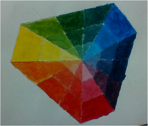
The primary colors are in the corners, primary colors are mixed to make the secondary colors, and the secondary colors are mixed with the primary colors to make the tertiary colors. White paint was added to make the paint brighter. The circle maker wasn't working so /i somehow made a triangle shape. The triangle shape worked well, but it would be better if the shades were more visible.
2 point perspective has two vanishing points. The letters that have straight lines are the easiest, the curved letters were more difficult to send to the vanishing points.
A horizon line and vanishing point is where the picture leads toward. The birds eye view of the city was confusing at first. I liked that I could shape the buildings to whatever shape I wanted. The windows on the square shaped buildings were fine, but the windows that weren't rectangular were a little difficult.
It was difficult to get the full range of value. The shading did well on showing the folds in the plane.Shadows are casted on the objects that are in the back. The lightest lights are where the light shines directly. The darkest darks is where there is no light at all. The wrinkles on the sheet were the hardest to shade, because they would randomly be light and dark.
The cans were drawn at an angle as if they were siting on a table.
Cans that are further away on the table are drawn higher and smaller on the paper. If I were to do this project again, I would draw the cans bigger for more details and to eliminate white space. I think the lines in the cans are good for showing the dents. |
Brandon LafertyI don't know what I'm doing. |